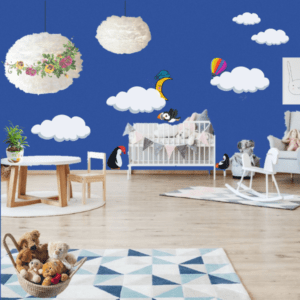
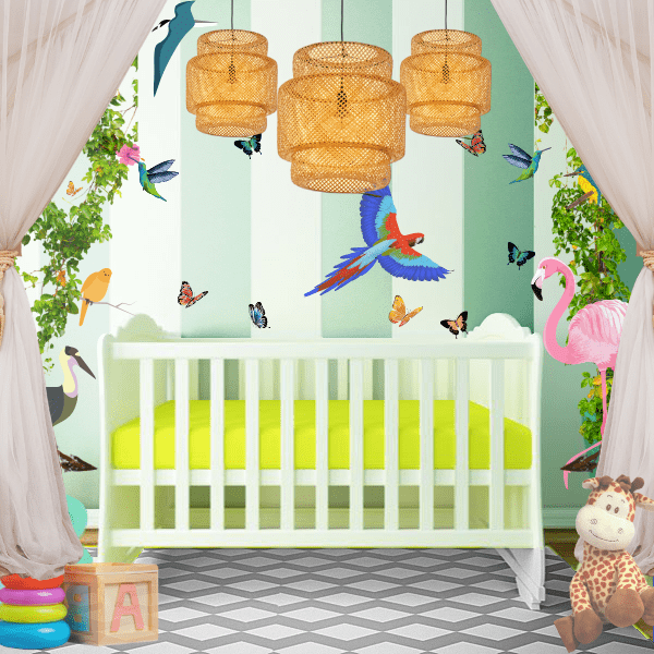
The baby’s room, the nursery, is the first very concrete project that makes Baby’s arrival a reality. It is often seen as an intimate room, where parents-to-be pour all their love and hope, for their soon-to-be-there little one. And parents usually want to do the best for their child. So what’s the best approach when it comes to nursery design?
 Scientific findings suggest that nurseries should ideally be soothing and stimulating at the same time. For a very long time, nurseries have been mainly decorated in white or pastels, giving parents a sense of cuteness and softness. However, recent scientific research has shown that these types of nurseries are equivalent to blindfolding babies because the similar colours deprive them of visual stimulation. And visual stimulation is essential for babies’ brains to reach their highest potential.
The good news is that now with these scientific facts, we actually have sensible data that we can use for designing babies’ rooms. It turns out that the best way to give babies visual stimulation right from the beginning (when it’s the most effective) is to use black and white. This is the strongest, most effective contrast that you can give your baby. While other colours can work as well, it’s important to remember that what seems like a “strong contrast” to your eyes means “just enough contrast” for Baby. Then, to introduce a soothing aspect in the room, which is important for the baby to sleep well, make sure that big, bold patterns are well separated from one another (a distance of 15 cm or more between each of them is fine).
 Finally, you can mix in as much cuteness and softness as you like, by adding soft textiles in the room and putting up family portraits and handmade decorations around your nursery. Now both Baby’s needs and your preferences have been taken into consideration.”


