

BE BRAVE WITH COLOUR!
How many of us when we walk into a decorating shop, maybe a funky restaurant, a decadent hotel lobby, read an interiors magazine, or visit an event like this find ourselves presented with vibrant and exciting ways to colour our home but yet when it comes to decorating our own home, we lose confidence and typically revert to the tried and tested safe neutrals.
Colour is probably the most useful tool of all at our hands. Handled properly it can make a small room seem larger; a dark room lighter or bring about a complete change of atmosphere. Colour is not just about our wall colours but also the fabrics, textiles and flooring we use.
Some people are nervous of colour but realising how to use in a balanced way can really transform our homes and lives.

– The starting point.
Some key questions to ask yourself before you embark on your colour project are:
- Will the rooms be used for relaxation, work, living or is it a high traffic area like the hall?
- Is there an inspirational piece of furniture or a painting that you would like to pick up a colour in it and enhance with a good background colour or a stunning fabric?
- Is there an investment piece that cannot be changed easily e.g. a sofa, curtains or carpet? Few of us have the luxury to start from scratch every time we decorate so we may need to be mindful in our selection.
- Work out what mood you want to convey- warm and cosy- cool and airy- bright and cheerful- contemporary and stylish.
- What aspect has the room for painting? North facing rooms have no direct sunlight but do have a consistent light during the day without the bursts of sunshine a south facing room would receive. North facing rooms do need warm undertones but they are great places to go for the dramatic with terrific colour rendering. Anything goes in a south facing room.
East and west have the reverse of each other with bright sunshine in the East in the morning and sun setting in the West. When the sun is absent, these rooms can appear dull and the solution is to use lighter colours in the east and warm whites with red undertones in west facing
- Finally think about your own emotional response to colours. Do you equate warm colours with cosiness or oppression, cool with relaxed or chilly? What colours energise you?
– Using more than one colour.
It is straightforward to pick one colour for a scheme but unless you understand tone, 2 or more can be tricky to combine.
Tone is the lightness or darkness of the colour- and is based on the amount of the actual colour and the amount of black and white it contains. The combination of both provides the tone.
It helps if you can recognise similar tones in different colours as you can create room schemes that are lively and interesting especially when it comes to mixing the different colour elements such as your walls, upholstery, curtains and scatters.
– Using pattern
Are you going to stick with one pattern or will you mix patterns? My advice is to be brave and use as many as you think the room can handle but a good rule is 3 or 5. Consistency is the key. Use tones & shades that are similar in each pattern and it will be successful.
Stripes can work well with florals. Alternatively you can keep patterns from the same family together e.g. some geometrics together or some botanicals together.
Look at the scale of the patterns so if you are using 3 different patterns, opt for 1 large pattern, accompanied by a mid scale pattern and a small scale pattern. The large patterned item should incorporate all your colours and pull the scheme together.
They should be interspersed with plain fabrics to rest the scheme and not appear too busy.
Distribute around the room evenly and you will be onto a winner.

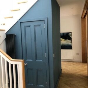
– Does Brave mean Dark?
Dark colours are dramatic and a real head turner but are not always a requirement as success is a question of scale and tone.
Moderation is the key as under stimulation –lack of variation in colour and tone can lead to a snooze fest and over stimulation- too much high intensity contrasts, can have you running for the door.
-Other ways to add a dash of boldness and flair
We have talked a lot about being brave with colour and there may be an assumption that it is just paint but we also have opportunity to be brave with colour in our use of fabrics and wall covering.
Wallpaper can open up a whole new world of creativity to decorating interiors- the pattern and lushness of some of the designs are a really powerful way to inject a brave statement element to an area especially where you may be limited for space egg a narrow hall and where paint is just not creating a sufficient impact.
Striking modern fabric makes a brave statement on its own. A multi coloured fabric in your curtains or sofa can also give you a huge variety of wall colours to choose from
Don’t overlook a sofa that is in a plain fabric but seek a vibrant shade. Go for your favourite colour. This will be a real conversation starter and people will be well impressed by your bravery in going for such a colour in a key core item. If you loved it from the start you will love it forever and it will be a great investment. The key is balance so make sure to accessorise it with non colour items such as wood, glass, metallic’s so your vibrant burnt orange sofa takes centre stage!
A safe easy place to be brave with colour is by introducing small bold accents of colour. Add some vibrant scatters to your sofa; bring some colour into your artwork and rugs. This will add dash of flair and style you never knew you had. Just be careful not to use the same accent in too many places or you lose the impact.
Summary
Colour can be a fantastic way to rejuvenate a space but colours must support the rooms function.
Bold and bright shades will give rooms a lift and create atmosphere if used correctly but proportion/balance is a really important element.
I read somewhere that you can think of colour as a seasoning whereby bolder more intense hues are like a stronger flavour and should be added sparingly.
Do try to be brave with colour and you could surprise yourself with the result. Tackling colour does require risk-taking but at the end of the day, especially with paint, there is always a solution!
Image courtesy Sinéad Cassidy Design